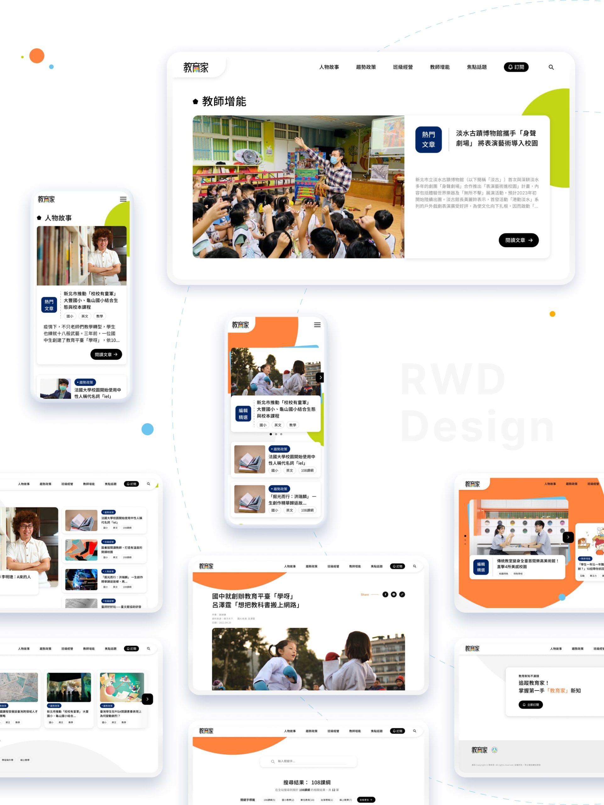
Teachers Blog is a platform for teacher support and growth. The redesigned experience helps highlight quality content and encourages cross-platform engagement.

教育家是一個促進教師互助與成長的平台,透過優化網站體驗與視覺形象,提升內容曝光與跨平台交流機會。

(Year)2022
(Type)Web Design

Overview

“One person can go fast, but a group can go far.” By bringing together the power of education, EduMaker offers strong support for teachers through a collaborative platform for professional growth. Within this community, educators learn from each other and adapt to the ever-changing social landscape, continually strengthening their skills. This redesign aims to enhance the browsing experience and refresh the site’s identity, making it easier for teachers and future educators to discover valuable content, foster cross-platform engagement, and elevate the visibility of the EduMaker brand.
「一個人可以走得遠,但一群人可以走得久。」聚集教育的力量,給予老師們最強大的支持。教育家是一個提供教師教學互助與成長的平台,在社群中學習教學,教師能因應不斷轉變的社會型態,強化發展的能力,這次改版設計希望以優化瀏覽體驗、重塑網站形象,讓老師及師資生更能看見本站優質內容,增加跨平台的交流機會,提升「教育家」網站知名度。
(01)

Project Goal

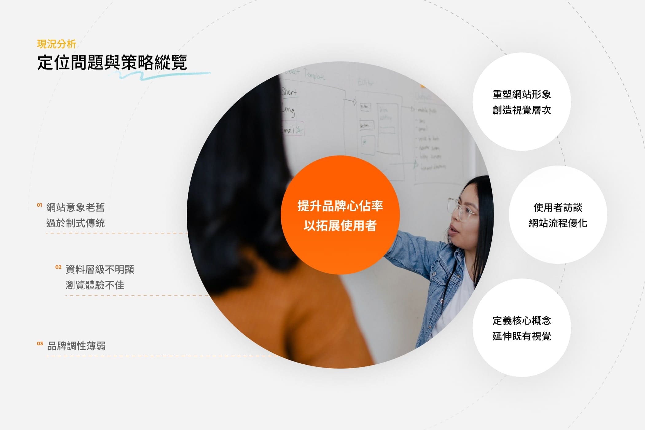
User-Centered Improvements
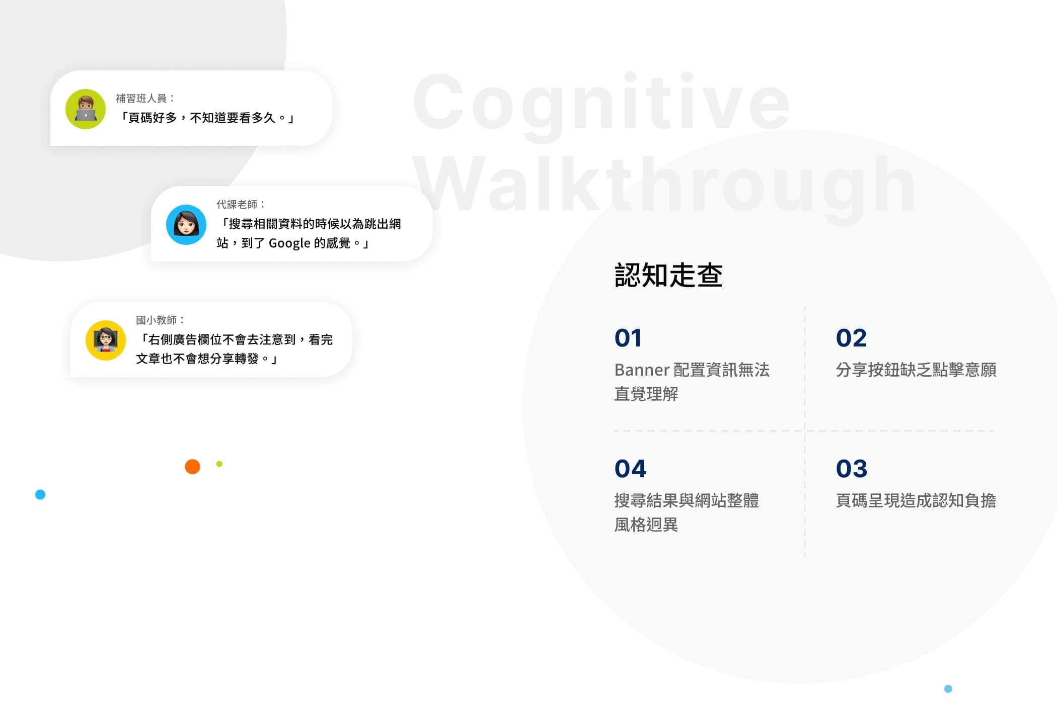
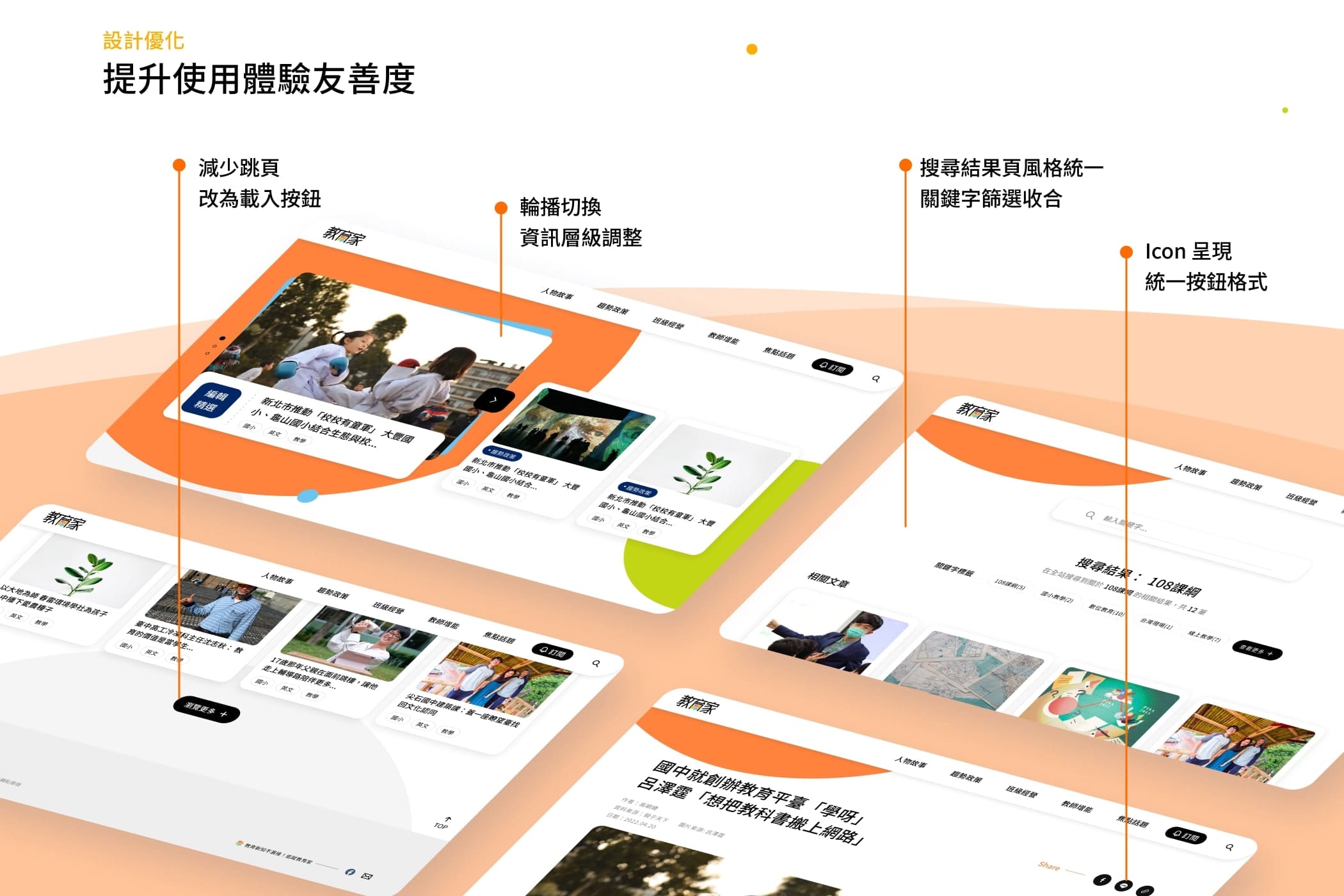
Before the redesign, we conducted usability testing to understand real user behavior. Based on interview insights, we addressed key issues such as unclear content hierarchy, topic categorization, keyword search, and tagging. These improvements aimed to make the website more user-friendly and intuitive.
Research consultant Ben Wan led the user experience research. Through cognitive walkthroughs and user interviews, he identified real usage patterns and pain points, helping improve the website’s overall usability and user experience.
使用者導向改版
在這次網站改版前我們透過認知走查了解到使用者實際的使用體驗,藉由訪談報告的結果,我們針對幾項關鍵問題點去做出設計上的優化,例如:資料層級不明顯、內容主題分類、關鍵字檢索功能、標籤等改善方式,提升使用者網站體驗友善度。」請翻譯成英文版
研究顧問本丸(Ben Wan)負責使用者體驗研究,透過認知走查與使用者訪談,深入了解實際使用情境與痛點,協助提升網站整體的操作友善度與體驗品質。
(02)

Concept

The Power of Unity in Education
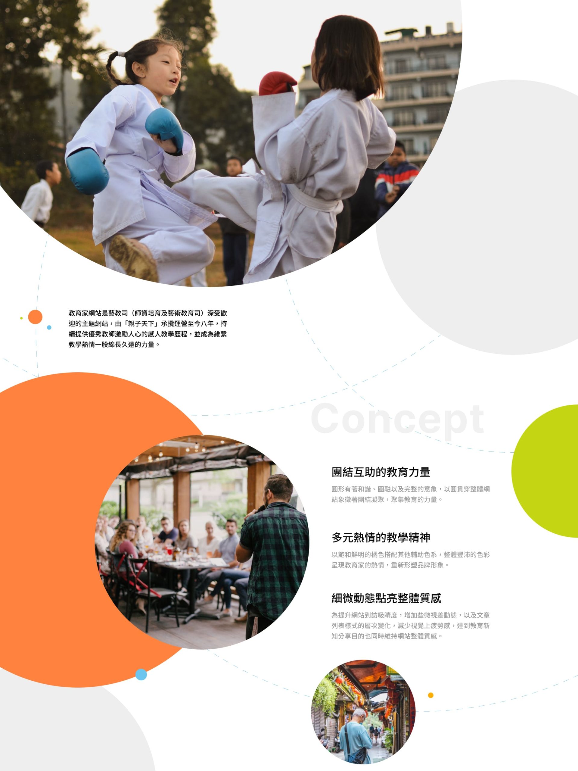
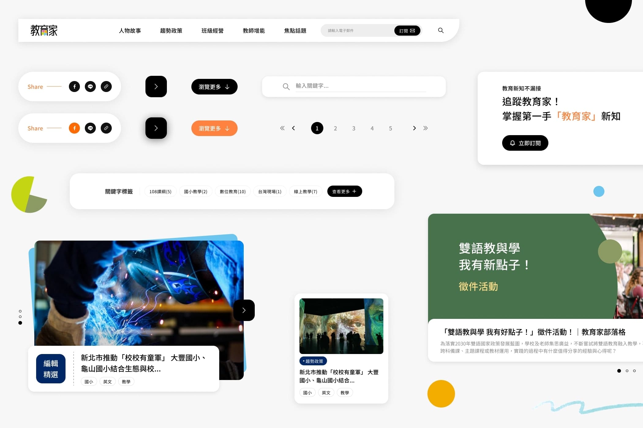
The overall visual design centers around the circle—symbolizing unity and collective strength within the education community. To reflect the platform’s spirit of sharing and mutual support, the homepage features animated bouncing spheres that represent the collision of ideas and the growth that comes from exchange. On this platform, every article is a vital source of nourishment for teachers on their journey of professional growth.
團結互助的教育力量
整體設計以圓貫穿網站視覺,象徵教育界的團結凝聚,聚集眾人之力,成為教師們在教育旅程中堅實的支持。為了更鮮明地傳達教育家平台「經驗分享、互助交流」的精神,首頁設計上,我以圓球形體的碰撞動態作為進場效果,呈現出教學理念在交流中激盪與成長的過程。在教育家這個平台上,每一篇文章,都是滋養教師成長的重要養分。
(03)

Credit

Client
教育部師資培育及藝術教育司
Creative Director
Lee Ming
Project Manager
Irene Ho
Cognitive Walkthrough
Ben Wan
Web Design
Roizi Lu
Motion Direction
Block Studio
Web Development
CacDi 綠擊掌數位
Special Thanks
TDRI 台灣設計研究院
Release Date
2022.07